Attendees read billboard-style posters longer, and talked to their presenters longer
Three years of survey data from a physical therapy conference: 147 posters, 469 responses, more engagement for the billboard format, and no drop in perceived rigor.
The question
The case for the billboard format has mostly rested on argument rather than measurement: a wall of text is hard to read in a crowded hall, so lead with the finding instead. That is a claim about how people behave at poster sessions, and claims about behaviour can be checked.
Ardolino, Nielsen, Morrison and Sullivan checked it over three years at the Academy of Neurologic Physical Therapy annual conference.1
What they did
From 2022 to 2024, ANPT offered the billboard format alongside the traditional one and surveyed attendees after they viewed a poster. The survey asked about engagement (time spent reading, time spent interacting with the presenter), knowledge transfer (how clearly information was presented, how relevant it was to clinical practice), and cognitive load.
A total of 147 posters were evaluated, 72 traditional and 75 billboard-style, drawing 469 survey responses. The team compared the two groups with independent samples t-tests and Mann-Whitney U tests.
Note the shape of this: it is a case report of a real conference, not a randomised experiment. Presenters chose their own format.
What changed
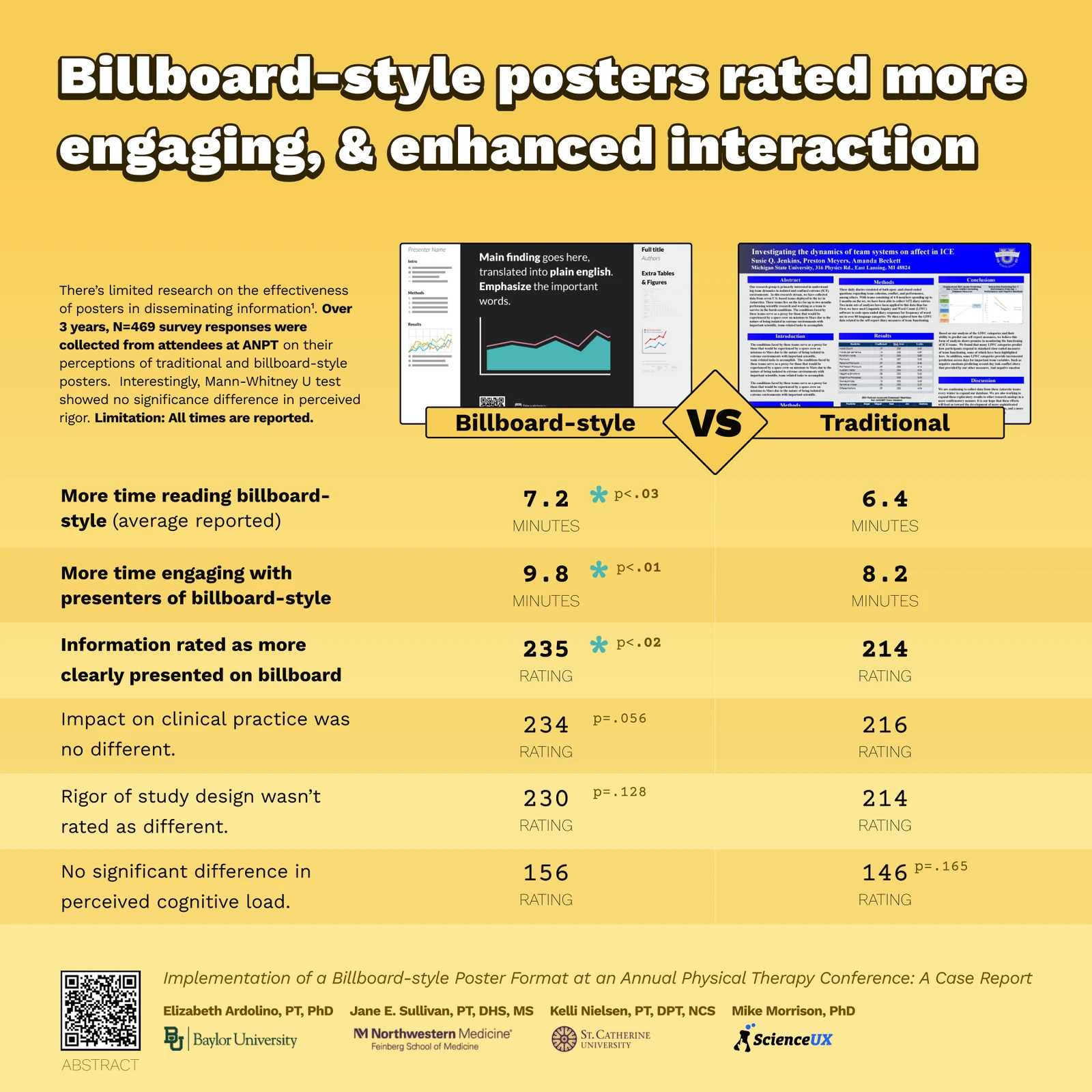
Attendees reported spending longer with billboard-style posters, and longer with the people standing next to them.
| Measure | Billboard | Traditional | p |
|---|---|---|---|
| Time reading | 7.2 min | 6.4 min | < .03 |
| Time engaging with the presenter | 9.8 min | 8.2 min | < .01 |
| Information clearly presented | higher | — | < .02 |
The interaction result is the one worth sitting with. The format's stated goal is to get the detail off the board and into a conversation, and the extra 1.6 minutes with the presenter is the closest thing here to evidence that it does.
What did not change
Three measures came back with no significant difference:
- Perceived cognitive load (p = .165)
- Rigor of the study design (p = .128)
- Impact on clinical practice (p = .056, a trend, but not significant)
The cognitive load result deserves to be reported plainly, because cognitive load theory is the usual theoretical justification for the format. Attendees did not report finding billboard posters easier on working memory. They read them longer and found them clearer, which is not the same claim.
The rigor result is the useful one
The most common objection to the billboard format is that a poster with one big sentence on it looks unserious, and that reviewers or colleagues will read the design as a signal of thin work.
This study found no significant difference in how attendees rated the rigor of the study design between the two formats. Attendees did not mark the work down for the way it was presented. That is a null result, and null results carry less weight than positive ones, but it is the null result the objection predicts should not happen.
Limitations
The authors are direct about the main one, and it is printed on the poster itself: all times are reported, not observed. Attendees estimated how long they spent. Self-reported duration is a soft measure, and a format that feels fresher may simply feel like it took longer.
Beyond that: format was self-selected by presenters rather than assigned, so the two groups may differ in ways the design cannot separate from the format. And one conference in one discipline is one conference in one discipline.
The poster
The team presented this work as a billboard-style poster, which makes it a reasonable thing to study on its own terms. The headline is the finding, the comparison is a table you can read from across an aisle, and the detail sits behind the QR code in the corner.
Read the paper
The full case report is open access in the Journal of Innovation in Health Sciences Education, published under CC BY-NC 4.0.
Can a Different Research Poster Format Increase Attendee Engagement? A Case Report
References & Citations
- [1]
Ardolino, E. M., Nielsen, K., Morrison, M., & Sullivan, J. E. (2026). Can a Different Research Poster Format Increase Attendee Engagement? A Case Report. Journal of Innovation in Health Sciences Education, 3(1), Article 4. doi:10.46409/003.RTHX8055.
https://soar.usa.edu/jihse/vol3/iss1/4