Better posters for better scientific communication.
Helping researchers communicate their work more clearly through evidence-based design.
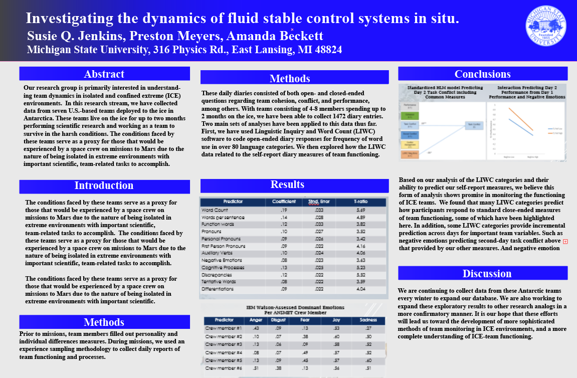
Dense wall of text · Hard to scan from 5 feet away
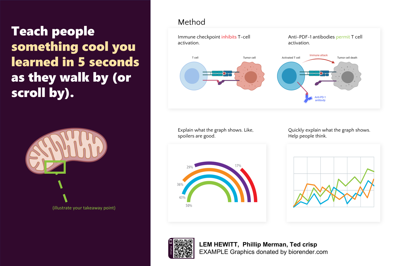
Plain-language takeaway · Clear message in 5 seconds




Layout Gallery
Different research deserves different ways of being presented. Start with the layout that best fits your story and presentation style.
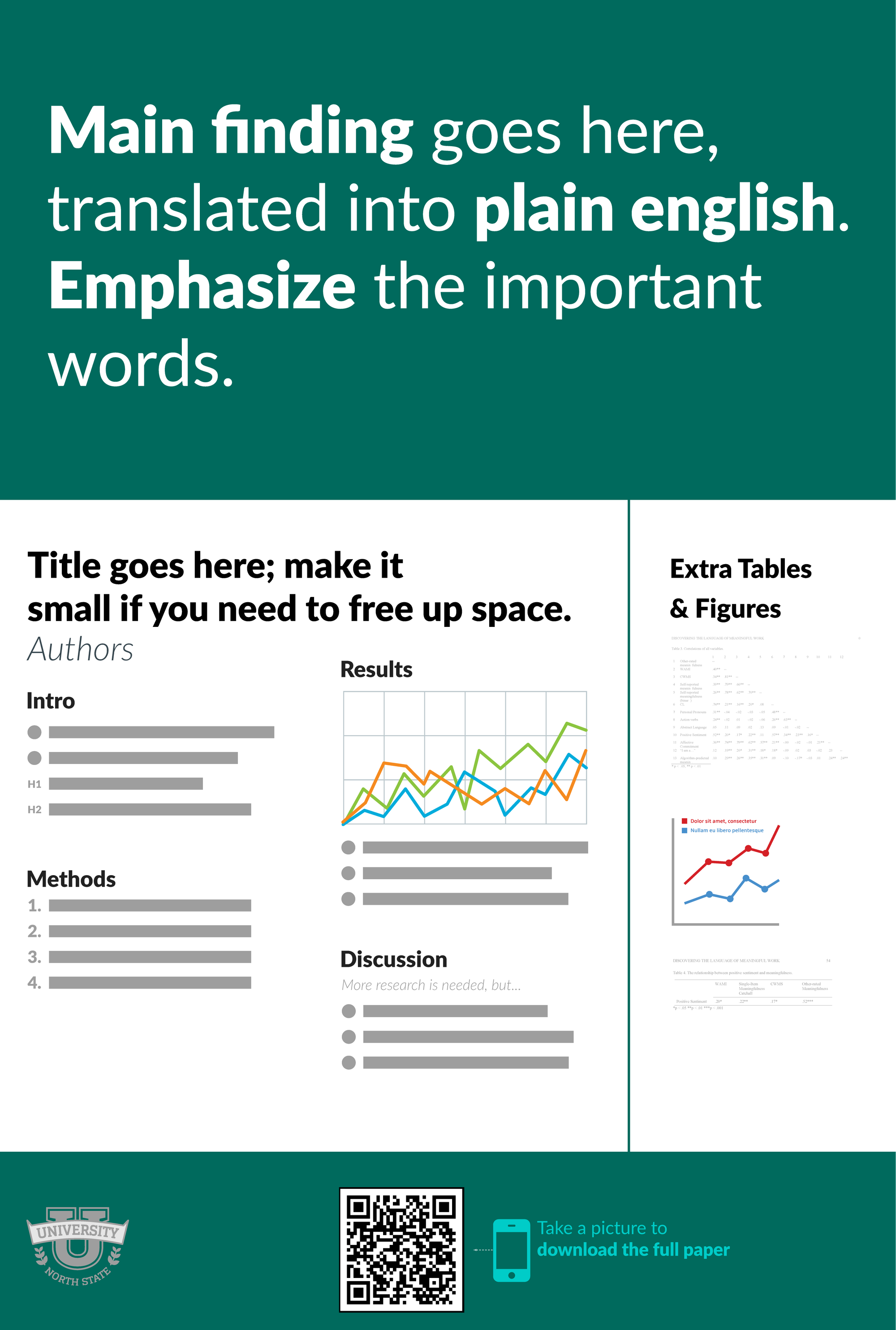
Classic Portrait
A familiar, structured layout designed for clear reading and easy scanning. Best for: text-rich research.
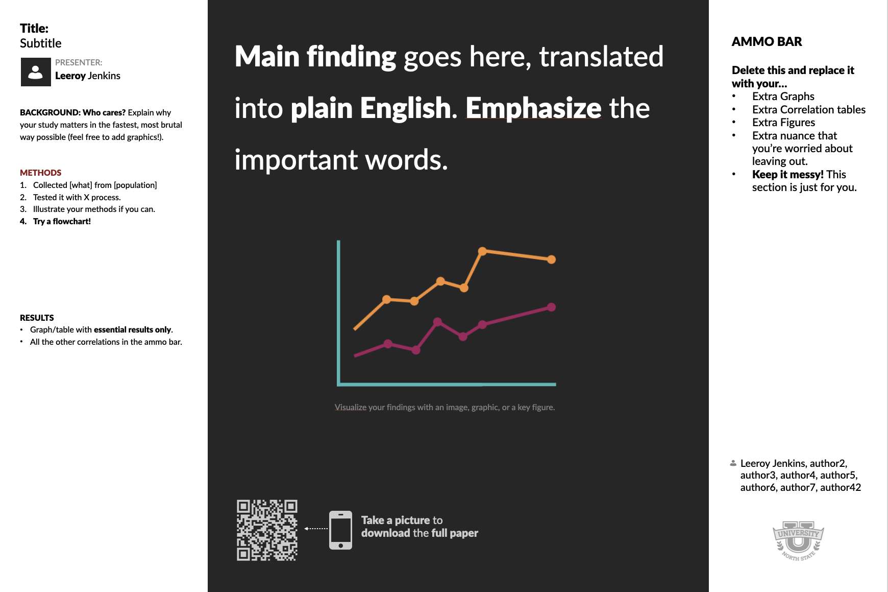
Classic Landscape
A flexible layout for balancing findings, methods, and data. Best for: general research.
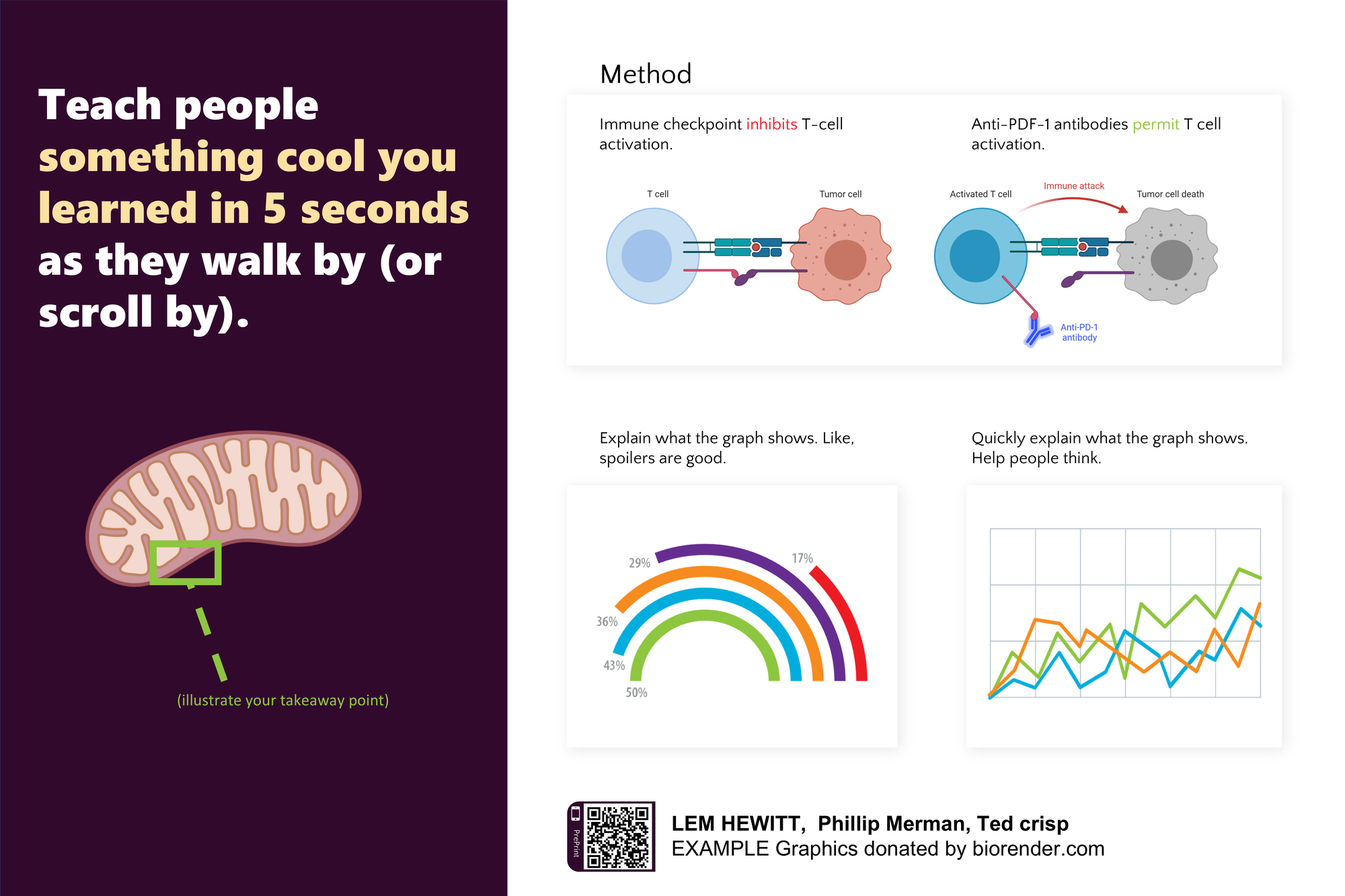
Presenter Layout
Designed to support spoken presentations, with a clear flow that guides the audience. Best for: conferences and talks.
Explore the ideas, research, and stories behind Better Posters.
- Video
Generation 1: the original #betterposter
Mike Morrison's talk introducing the format — why a poster should lead with one plain-language finding instead of a wall of text.
Watch(opens in a new tab) - Video
Generation 2: refining the format
The follow-up. What changed after the first design met real conference halls, and how the presenter and hero-figure layouts came out of it.
Watch(opens in a new tab) - Video
What do people look at on your research poster?
Eye-tracking results showing where attention actually goes at a poster session — and how little of it reaches dense body text.
Watch(opens in a new tab) - Video
Upgrading Doctors Without Borders' science communication
The format applied outside the conference hall, with a team whose research has to reach people fast.
Watch(opens in a new tab) - Article
Making poster sessions accessible
How poster sessions exclude scientists with disabilities, and what layout choices measurably help.
Read